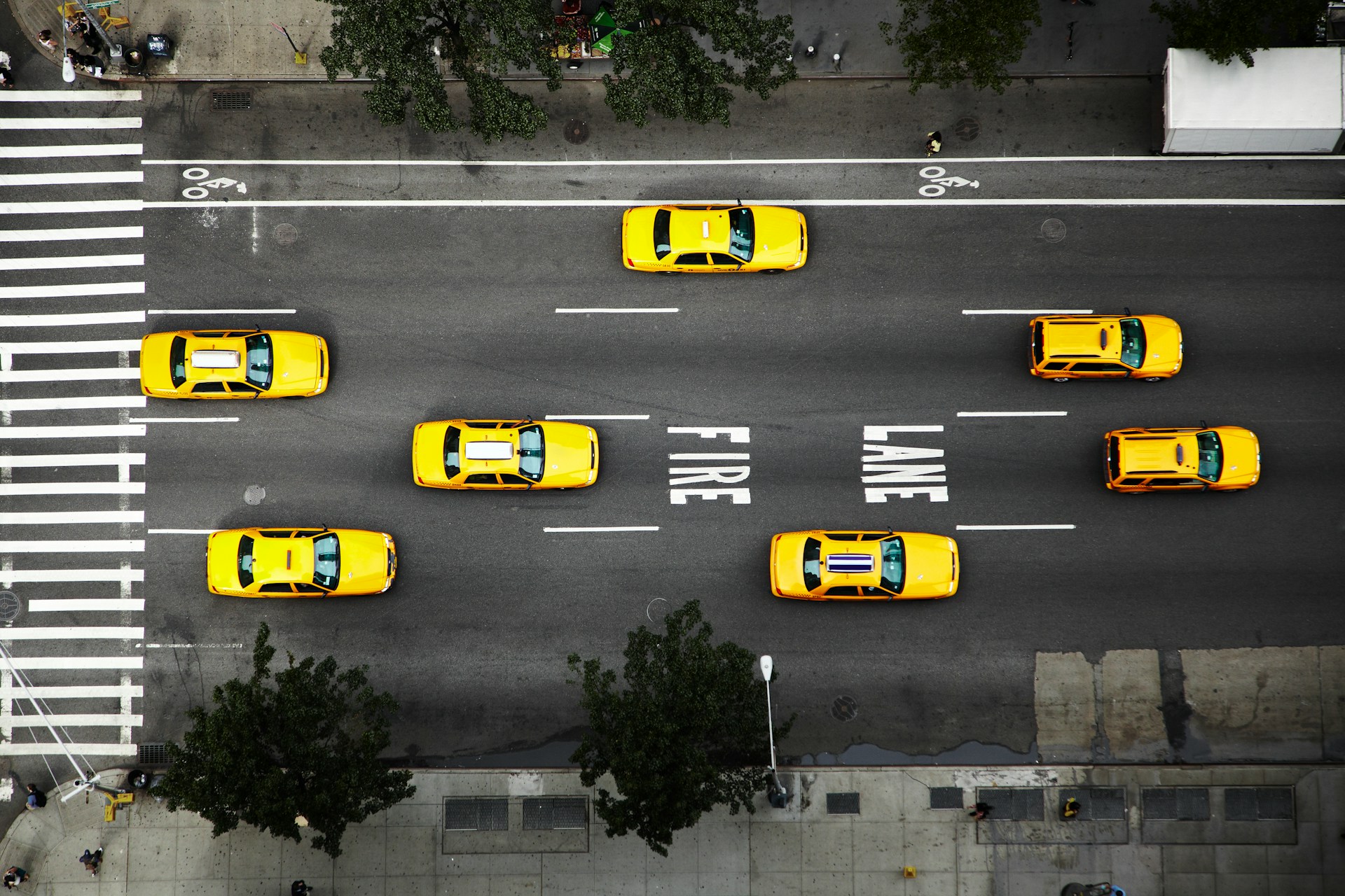
Fast choices behind the wheel are the norm, not the exception. Whether we’re driving smooth highways under a clear sky or navigating a dim evening commute, the signs that guide our paths need to send the message quickly. That’s part of why design isn’t just about appearance. The shape, size, color, and placement of highway safety signs all play into how well they do their job.
Since February brings earlier sunsets and leftover winter messes along road edges, any delay in how long it takes someone to read a sign becomes more noticeable. Snowbanks, faded posts, or even dense tree shadows can block messages right when they’re needed. Now is a good time to think through how well your highway safety signs are holding up or if they need a second look. The difference between a clear sign and a hard-to-read sign can mean the difference between safety and risk, especially when drivers are already on alert due to tricky weather. Drivers in winter face unpredictable conditions, so a sign that’s quick and simple to understand is a huge asset.
Clear Font and Lettering Make a Big Difference
When signs are hard to read, drivers take longer to respond. In high-speed areas, that delay can make everything feel more tense. The type of lettering on a sign affects how quickly the brain picks it up. Legibility is at its most important when the weather causes distractions, like blowing snow, reflections, or fog.
- Simple block lettering in all caps helps word shapes appear bold and familiar.
- Signs with thick lettering and clean spacing stay crisp, even when viewed at a distance.
- Bigger letters make reading signs easier before drivers are right on top of them, not after.
Speed matters. If someone has only a few seconds to read and react, every little design detail counts. That’s why narrow or fancy fonts delay reactions, particularly on roads where cars move fast. Wide, plainly spaced letters are easier to read right away, with no extra guesswork. Road font standards have developed for a reason, they’re simple, direct, and leave nothing open to mistake.
A clear font also combats the smudge or streaks that can form on signs during wet winter days. As signs age, some letter styles fade faster than others, so using the right font keeps things practical in the long term.
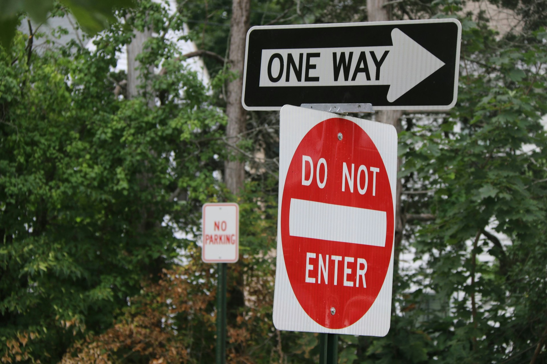
Color Combinations That Grab Attention
We all learn it from a young age, certain sign colors mean certain things. Yellow gives caution, green points us toward directions, red says stop. These colors don’t show up by accident. They’re there because years of use have trained our eyes.
- Black on yellow works well for warning signs because the contrast pops against sky or snow.
- White on green is clear for exits and city names, grabbing focus in less urgent settings.
- Reflective red backgrounds make stop signs hold attention at night and in low-visibility spots.
During late winter, the light stays low through most of the day. A sun sitting closer to the horizon means glare can hit windshields or reflect off slushy roads. That makes contrast more important. Shiny white text on pale gray or faded backgrounds can vanish at the wrong angle. Road signs that rely on seasonal color clarity should stay bold no matter what February throws at them.
Color choice isn’t just for looks, it’s about making sure a sign is visible every hour of the day, regardless of weather. Good contrast stands out whether the backdrop is snowy, muddy, or washed in direct sun. When snow piles high or mud gets splashed on the sign, having maximum contrast helps keep messages stand out even as they get partially covered.
Colors can also be boosted with reflective surfaces. These ensure that even in low light or direct headlights, the message is unmistakable. Picking combinations that cut through haze, ice film, or night glare is an extra step that’s especially helpful in winter.
Lighting, Shadows, and Time of Day
Winter isn’t just about snow, it’s about how quickly the daylight disappears. And when it’s cloudy or sleeting, drivers may go an entire day without strong lighting. Highway signs that work great in full sun may struggle once shadows creep in.
- Shadows from overpasses, snow piles, or trees can cover part of a sign all day long.
- Glare during sunset can bounce off signs, washing out the message just when traffic jams the most.
- Dim conditions call for reflective surfaces that push the lettering forward, even in headlights.
Some of the hardest times to read signs come during the last hours of a February afternoon. That’s when roads are wet, daylight gets thin, and vehicles bunch up before dinner hours. Positioning signs in visible zones and making sure they reflect well is one step we can take to keep drivers calm and well-informed.
Many drivers travel the same roads day after day, yet visibility changes as the sun sets earlier and earlier. Shadows move across the pavement and can block signs drivers depend on. Even something simple like a tree that wasn’t problematic in summer may cast a much denser shadow across a sign once its leaves are gone in winter. When it’s dark by early evening, highway safety signs with reflective coatings, angled placements, and high-contrast text make a significant difference in how fast messages get processed.
Headlights interacting with road signs is another factor. In winter, when drivers rely on headlights for more of their commute, reflective signs shine the message back rather than fading into a dark roadside. It’s not just about brightness, placement and reflectivity work together so a message can be read just as well from behind a windshield after sunset as in daytime.
Where You Place the Sign Matters Most
A well-designed sign still won’t help much if it’s in the wrong spot. We’ve noticed that placement near curves, exits, or merge points can be the difference between good flow and last-second swerving.
- Signs that stand too close to the road might not be seen until too late to react.
- If a sign’s angle faces the wrong way, its message gets lost in a split second.
- Signs set too low might hide behind snowbanks or fade into roadside clutter.
It’s always better when a driver notices a sign before they need it. That way, even if visibility is low or traffic is thick, they have time to read and react. Sometimes, moving a sign just several feet away from an overgrown branch or hill crest makes it more useful than replacing it entirely.
Smart placement also means thinking ahead about how snow gets pushed by plows or where extra piles might block the lower half of a post. During late winter when snow has built up, a sign that’s too low might simply vanish from sight until the spring thaw comes. Placing signs higher, or at the angle of visibility for winter drivers, can add a big margin of safety and clarity.
Placement also includes making sure there’s nothing around the sign to detract from its message. Bright advertisements, crowded street corners, or areas with lots of visual clutter can make it harder for a sign to compete for attention. In winter, brighter backgrounds or shifting daylight may mean what worked in summer becomes a problem. Regular checks as conditions change keep signs impactful and visible.
Adding a few moments to consider nearby lights, overpasses, and typical snow piles can ensure that every sign gets seen as intended. The more time a driver has to react, the safer the road can be, especially on slippery or busy late-winter afternoons.
Driving Safer with Signs That Do Their Job Fast
Highway signs don’t have to be fancy to work, just clean, clear, and easy to spot the first time. Every piece of how they’re built plays into how safe people feel as they drive past. When we talk about smooth travel, what we’re really talking about is being able to understand what’s coming next without second-guessing.
From font style and color use to light reflection and smart spacing, we see how these details help drivers stay ready. Especially in late winter, when snow lingers and light stays low, the right sign setup helps ease tension, lower confusion, and give people the confidence to move forward without delay. Preparing signs now means smoother trips before the spring thaw arrives.
Enhance the safety of your roads this winter with our expertly designed highway safety signs. At Hyperformance Traffic Safety Supplies, we prioritize creating signage that is not only visible but also quickly readable in challenging conditions. From strategic placement to high-contrast colors, our signs are built to withstand the harshest winter days. Trust us to deliver signs that keep drivers informed and safe, ensuring every journey is as smooth as possible.