Custom signage has a bigger impact on your brand than most people think. It’s not just about slapping your logo on a wall or post. Where you place that sign, how big it is, and what it looks like all play a part in how people see and remember your business. When done right, signage guides customers, highlights your message, and strengthens your visual identity from the moment someone spots your location.
It doesn’t matter if you run a small storefront, manage a busy property, or maintain a school campus. Placing signs in the right spots can help people notice you faster and feel more confident in where they’re going. If you’re already investing in custom signage, it only makes sense to make sure it’s placed where it does the most good. Thoughtful placement can maximize visibility and help your signage work harder for your brand.
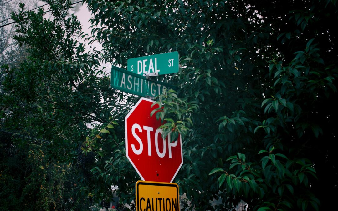
The Science Of Sign Placement
Think of signage like a handshake. It’s often your first chance to make an impression. But if your signage is crooked, hard to read, or out of sight, that impression can fall flat. Strategic placement focuses on three main factors: visibility, readability, and relevance. These work together to make sure your signage isn’t just seen, but understood.
Here are a few key things to keep in mind when deciding where and how to place your custom signage:
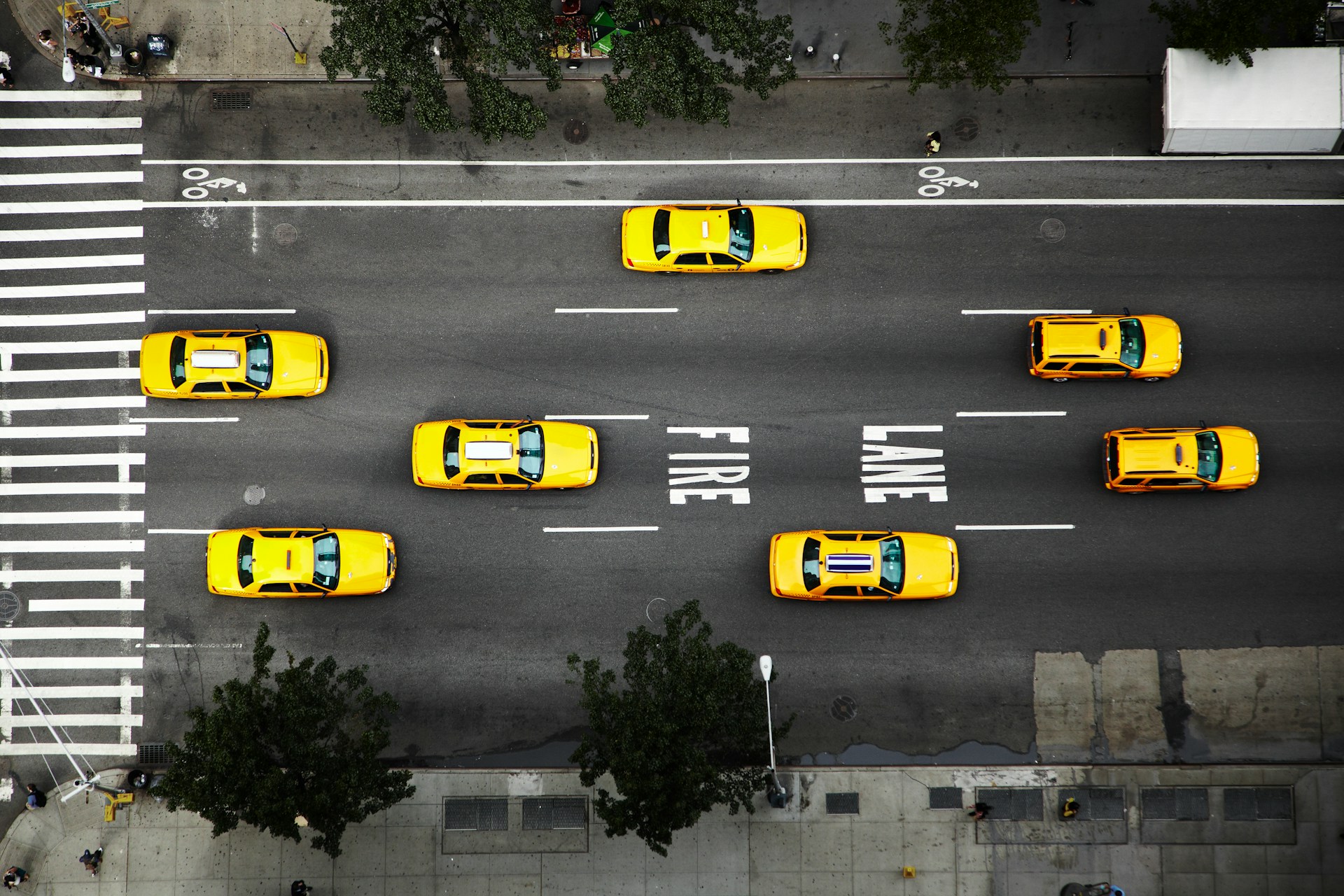
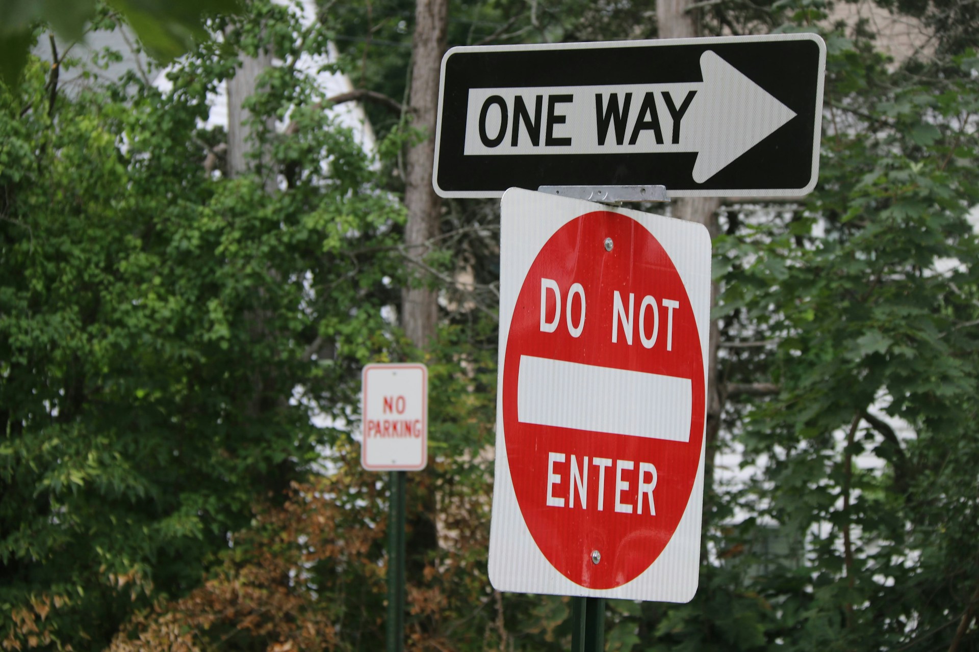
– Line of sight: Signs need to be placed where people naturally look. For drivers, that usually means slightly above eye level and perpendicular to traffic. For pedestrians, it’s somewhere that catches the eye as they approach.
– Lighting: Signs under shadow or inconsistent lighting can go unnoticed during key times of the day. Use placement and materials that improve visibility in both bright sun and low-light conditions.
– Viewing distance: A sign that’s too small from a distance might be missed altogether. Size and font choices should align with the expected viewing range.
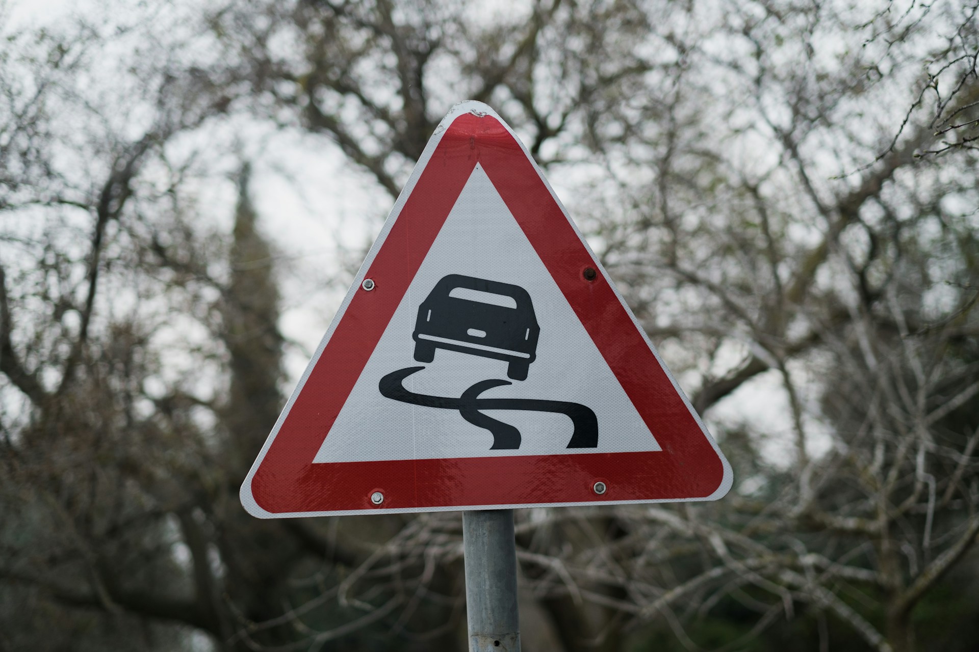
– Background contrast: If a sign blends into its background, it loses impact. Colors should stand out clearly against the surrounding area.
– Angle: Your sign should face its intended traffic, whether that’s foot or vehicle. Angling a sign slightly toward traffic often makes it easier to read from a distance.
For example, one local gym placed a bright, branded sign facing the parking lot, hoping to draw in more members. But it was installed at a height better suited for foot traffic, so drivers barely noticed it. When the sign was moved up and rotated to face the main road, visibility improved right away.
Good placement doesn’t require fancy tech tools. It just means thinking like the people who pass your space. Step back, test out different angles, and walk around the area. If a sign is hard to spot or read from even one direction, it’s worth reassessing.
Leveraging High-Traffic Areas
If your goal is to get noticed, place your custom signage where the most people can see it. That might sound obvious, but prime locations are often overlooked or misunderstood. Observing how people move around your space can help pinpoint where they naturally pause, gather, or slow down.
High-traffic areas to consider include:
– Entrances and exits: These are places where people look for direction. A clear sign can guide them in and make a strong first impression.
– Reception or waiting areas: Visitors usually have a little downtime here, which gives them time to notice and absorb information.
– Decision points: Areas where people choose which direction to go are perfect for signage that encourages a desired action.
– Frequently used paths: Sidewalks, hallways, and driveways consistently bring foot or vehicle traffic close to signage. These are smart placement zones.
Choosing these spots often takes some trial and error. Walk your site during different times of day. Watch how people move. Where do they pause? Where do they turn their heads? Use signs to meet them where they already are. Great placement can turn a casual glance into a lasting impression.
Complementing Interior And Exterior Designs
Custom signage goes beyond providing direction or information. It often plays a key role in setting the tone of your brand. Whether inside or outside, your signs should feel like a natural part of your space. If the colors clash, the design feels outdated, or the materials don’t match the environment, the sign might distract rather than support your brand.
Here are some ways to make sure your signage fits the space around it:
– Match the finish and color palette to your exterior materials. A wooden sign might blend better with a brick wall than a modern plastic one.
– For indoor spaces, use clean fonts and neutral tones in modern offices. Spaces with more color or texture might call for bolder designs.
– Consider the size of the room or exterior area so your sign feels balanced, not overwhelming or overlooked.
– Font style should reflect your voice. A playful brand may use rounded or script fonts, while a professional office may stick with clean, bold lines.
– Choose materials that fit both the function and the feel—metal, wood, vinyl, or composites. Each creates a different vibe.
One retail store made a major improvement by updating their signage from colorful, busy designs to a crisp layout with neutral tones. That simple change cleared up visual clutter and pulled customers through the space more naturally. The signage didn’t just fit the store—it helped support a better experience.
Being bold is fine, but keep it connected. A standout piece can still feel like part of the whole when every design choice respects the surroundings.
Enhancing Customer Experience With Signage
Signs that are placed well don’t just improve branding. They make life easier for the people who visit your space. Whether someone is trying to find a waiting area, check in at a kiosk, or figure out where to park, clear signage cuts frustration and helps things flow more smoothly.
Some ways signs can improve your customer experience include:
1. Wayfinding signs: Direct people without forcing them to ask or guess. Ideal spots include entrances, intersections, hallways, and elevators.
2. Informational signs: Make your rules, services, or hours known right when people need the info.
3. Reinforcement signs: Use these near desks, checkout points, or exits to show people they’re in the right place or to say thanks.
Walk through your space as if you’ve never been there before. Would you know where to go or what to do next without asking? If not, signage can help reduce stress while making your business feel more organized and inviting.
Good signage answers questions people haven’t even asked yet. That makes your space more welcoming and leaves a stronger impression overall.
Making Signage Work Smarter For Your Brand
Smart use of custom signage isn’t just about having more of it. It’s about making each piece work harder. A sign isn’t just a flat display. It tells a story, offers help, and creates trust, sometimes all at once.
Think of signage as a tool that can serve multiple goals. It signals what your brand stands for, it clears up confusion, and it helps move people where they need to go. When signs are placed with care, the entire space feels easier to understand and more enjoyable to move through.
Instead of thinking of signage as part of your to-do list, treat it like part of your brand voice. Every font, angle, and message sends a signal. A well-placed sign can leave an impression that lasts long after someone leaves your building.
Being thoughtful about where and how your custom signage appears means you’re not just showing people where to go — you’re showing them who you are.
For expert guidance to maximize the potential of your custom signage and ensure it aligns perfectly with your brand’s goals, explore the wide range of solutions available at Hyperformance Traffic Safety Supplies. Let us help you enhance your space, connect with your audience, and make a lasting impression with signage that works smarter for your business.